Introduction
Karafarin Bank, one of the leading private banks in Iran, offers a comprehensive range of financial services, including personal and corporate banking, wealth management, investment advisory, and digital banking solutions.


Problem
The Karafarin Bank provided its services online. All of these services were outsourced to external companies, meaning that each of the internet banking, mobile banking, encryption, and other systems were developed and operated by different companies.
There was no coordination or consistency in terms of user experience or appearance among these services. Even the services they provided were different. Each system had a different backend, so they operated with different usernames and passwords and did not offer the same banking accounts.
With the increase in online services and the growing use by customers during the COVID-19 pandemic, this problem became even more pronounced.
Goal
Therefore, the bank decided to create an internal and integrated system for its online services. This system was expected to provide a consistent user experience and user interface across all channels.
This omnichannel system had to be designed for iOS, Android, web desktop, web tablet, and web mobile platforms.
To achieve its goals, the bank assembled a new team consisting of backend developers, frontend developers, banking system analysts, and myself as
the sole product designer.
The Steps I Did
- Interview With Stakeholders
- Competitor Analysis
- Feature List
- Definition Of Persona
- Information Architecture
- Wireframe Design
- Design System
- Interface Design
Interview With Stakeholders
I conducted interviews with individuals from various departments within IT Bank, including core banking, digital banking, research and development, as well as several key managers within the organization. These interviews aimed to understand their needs and perspectives. However, due to security reasons, I am unable to share the interview documents.
Competitor Analysis
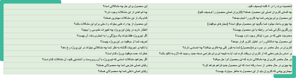
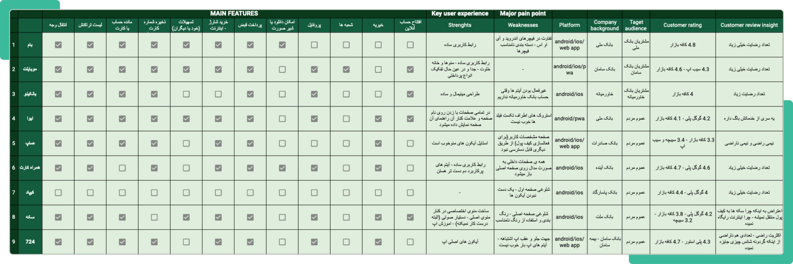
After market research, I made a list of available competitors. In the initial review, I selected nine of them for analysis. In these analyzes, I extracted a number of common product features.
Feature List
After reviewing the current products of the bank, analyzing the interview results, conducting competitive analysis, and considering the business requirements, I have arrived at a feature list.
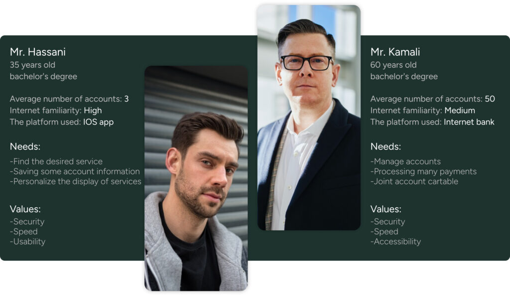
Definition Of Persona
Based on the data received from active customers in the online banking portals and examining their characteristics, two persona models were identified.
I had access to precise numerical data; however, due to the banking privacy policies, I am unable to present or share this information.
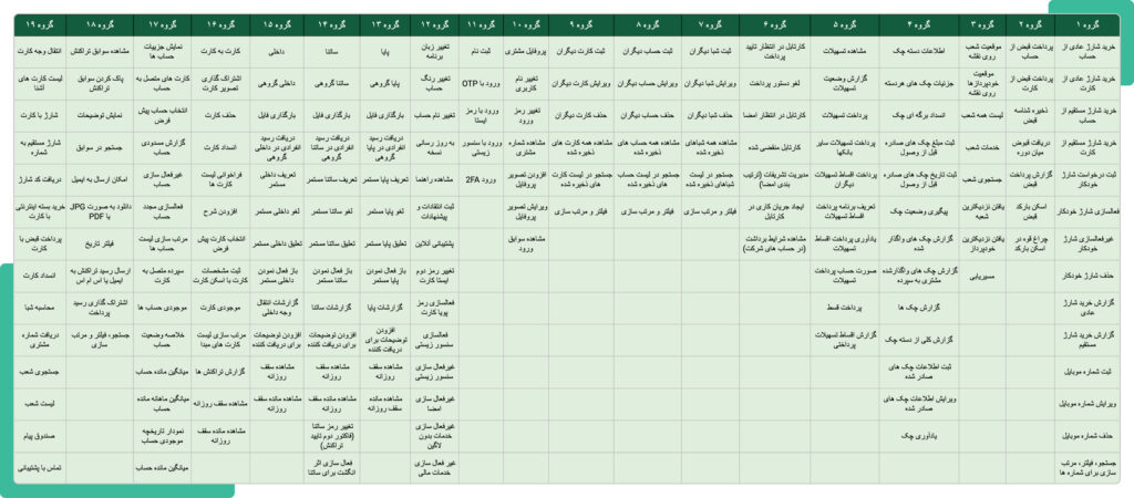
Information Architecture
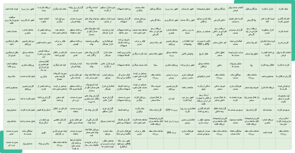
In this project, I used the card sorting method for information architecture. This method help us to prioritize and organize information. After writing the features on cards, we requested individuals within the organization who aligned with the personas to categorize the cards according to their own mental models.
Due to security issues within the bank, seeking assistance from individuals outside the organization was not possible.
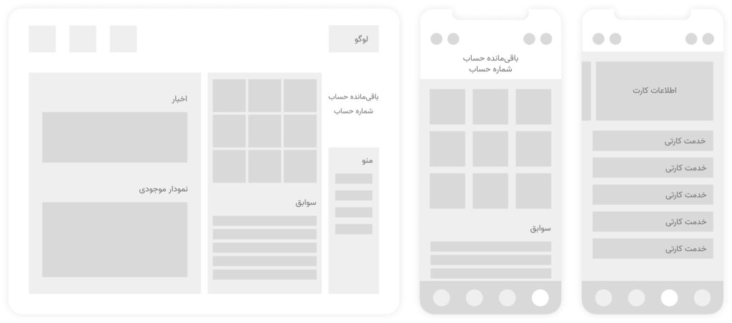
Wireframe Design
Considering the steps accomplished so far and the information acquired, I have initiated the low-fidelity wireframe design.
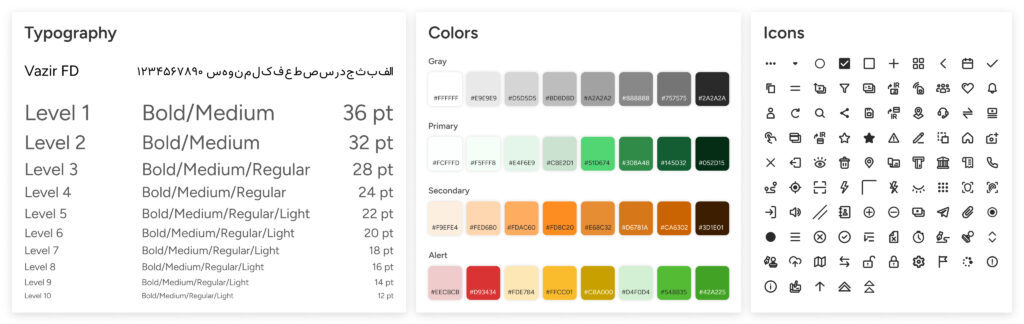
Design System
After finishing the wireframe designs of the pages, I proceeded to design system. I began by selecting a color palette, consisting of primary and complementary colors, a grayscale spectrum, and more. Following that, I made font choices, defined font styles, designed icons and necessary initial icons, established spacing, grids, radius , buttons, input fields, and other essential elements.
Interface Design
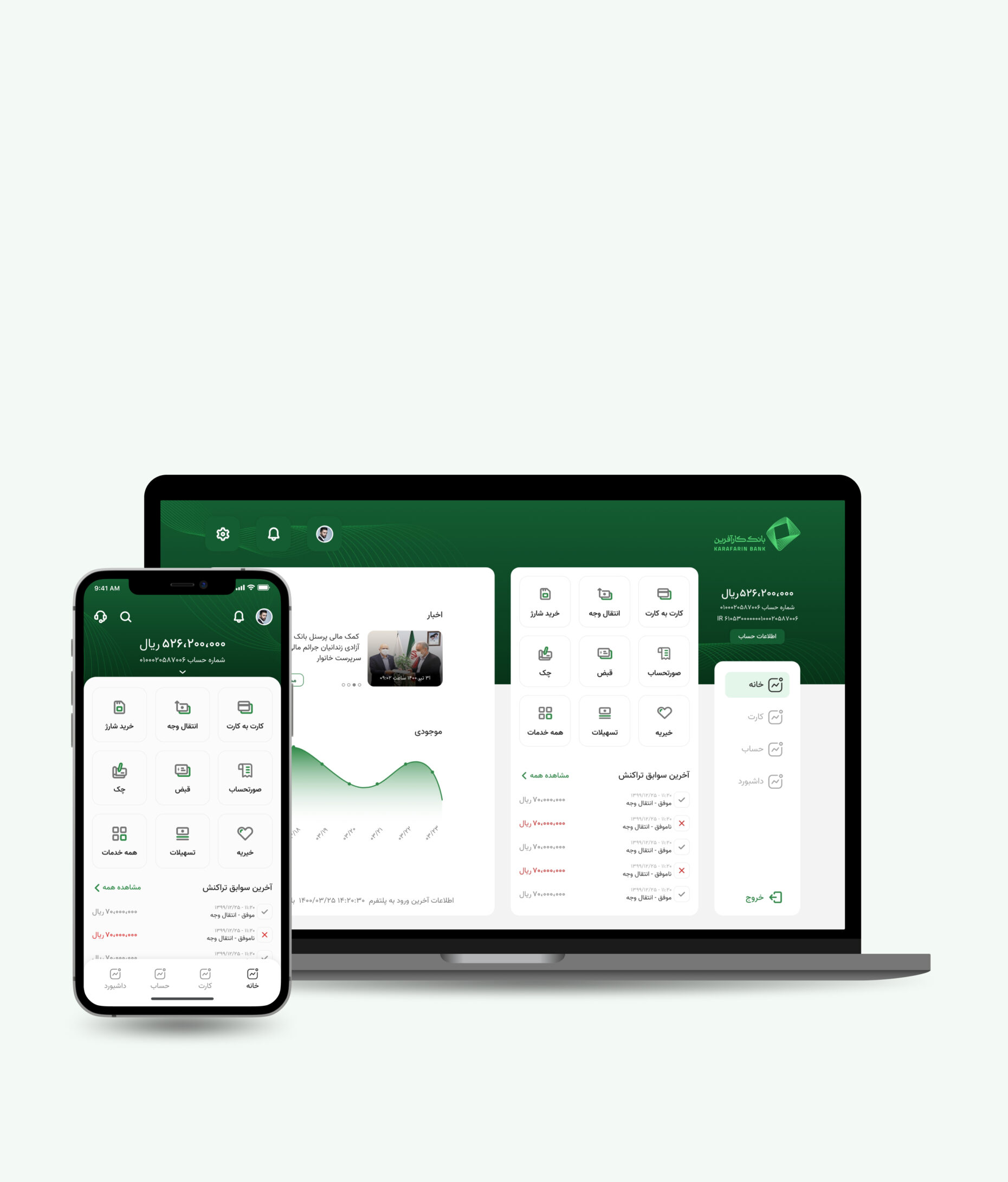
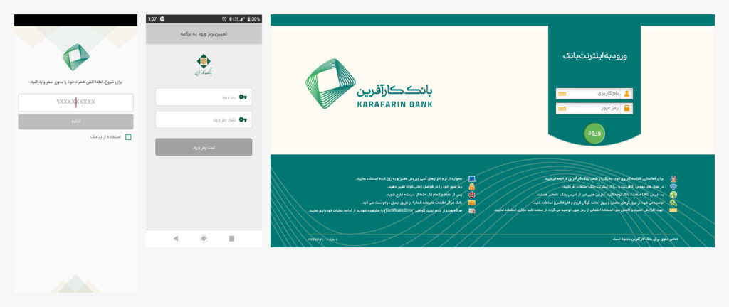
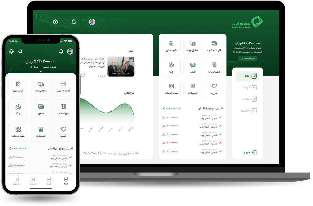
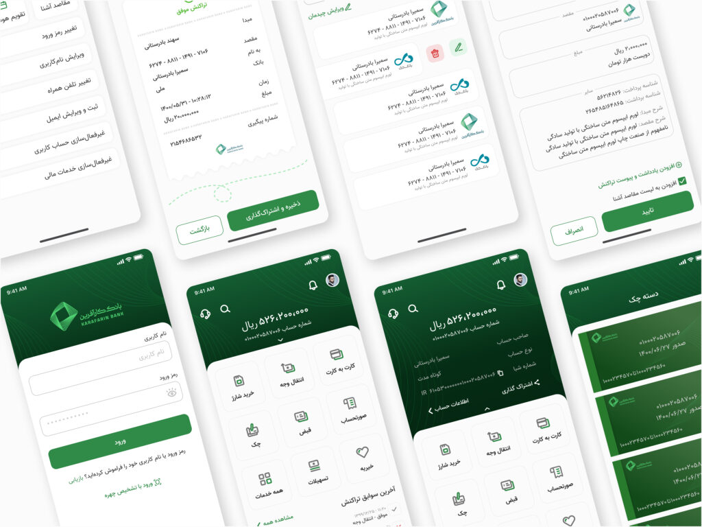
This product was designed for Android app, iOS app, Web (Desktop and responsive).
Some Design Challenges
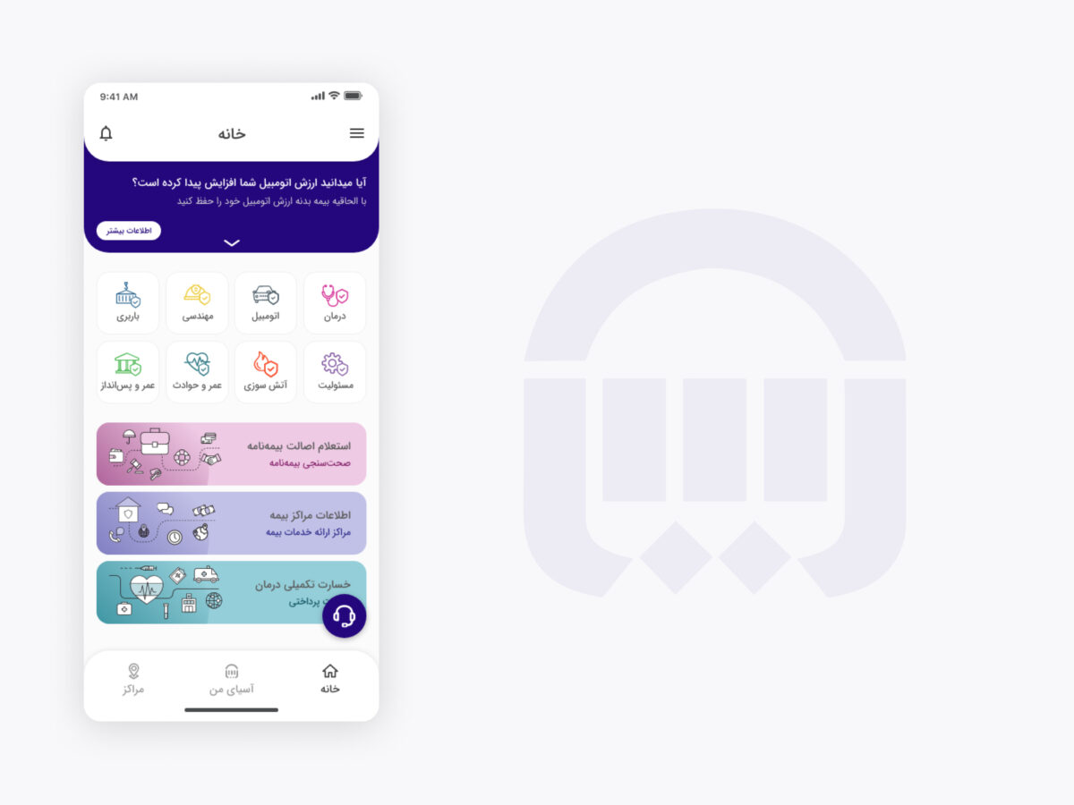
- Optimizing Service Access for Bank Users
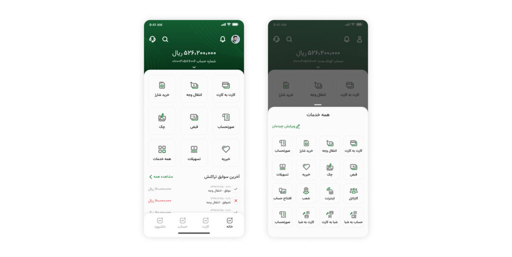
The bank offers a large number of services, and each user utilizes a subset of them based on their individual needs and preferences. If all services were always in front of the user, it would be overwhelming and confusing. On the other hand, if every service required an additional action, users would have to perform extra steps to access commonly used services.
- Balancing Accessibility and Personalization
To address this, I have placed a limited number of services on the main page, reducing the need for additional actions. For the remaining services, users can access them with a single action on a separate page. To further personalize the experience, I have provided users with the ability to customize the layout of services on the main page. However, considering that a particular group of users has less familiarity with technology, they may struggle with this feature. Therefore, I have requested the product developers to automatically arrange the most frequently used services on the main page for this user group.
- Balancing Speed and Cost Efficiency
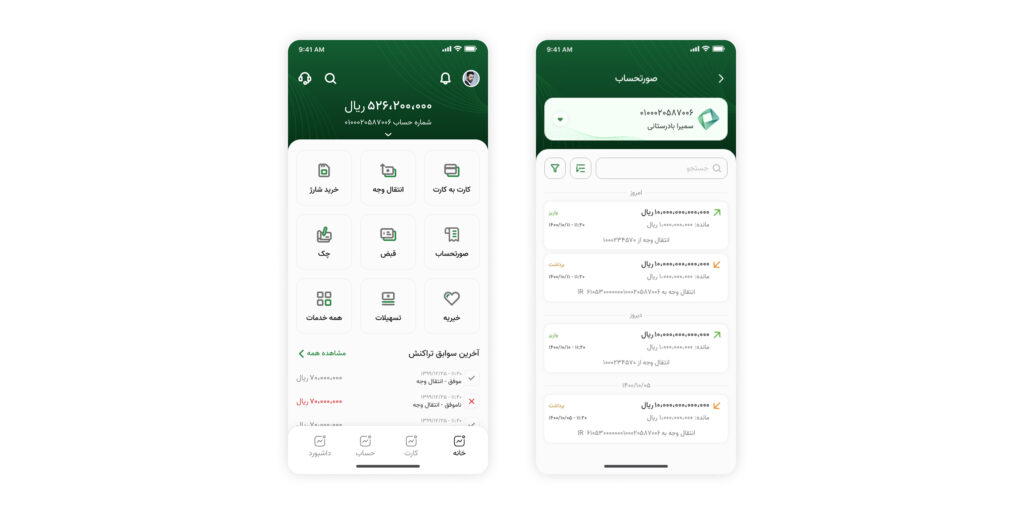
One of the users’ needs is to view their recent transactions on the home page so that they can see successful, unsuccessful, or unknown transactions. Initially, I decided to display the user’s transactions on the home page. However, retrieving the transactions based on the account from the bank is slow and takes a while to load, and each time retrieving the transactions incurs a cost for the bank. The slow loading time made the home page load very slowly, giving the user a poor experience. Additionally, every time the application is opened, even if the user doesn’t need to see the transactions, there is a cost for retrieving the transactions from the bank.
- Focused Transaction Display
Considering these conditions, it was decided that just the transactions of this system should be visible on the home page. If the user needs to see the main invoice, it will be displayed to them in the invoice section with a user action.
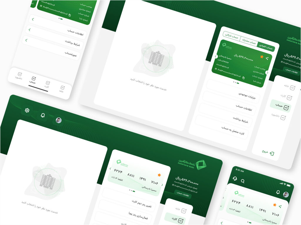
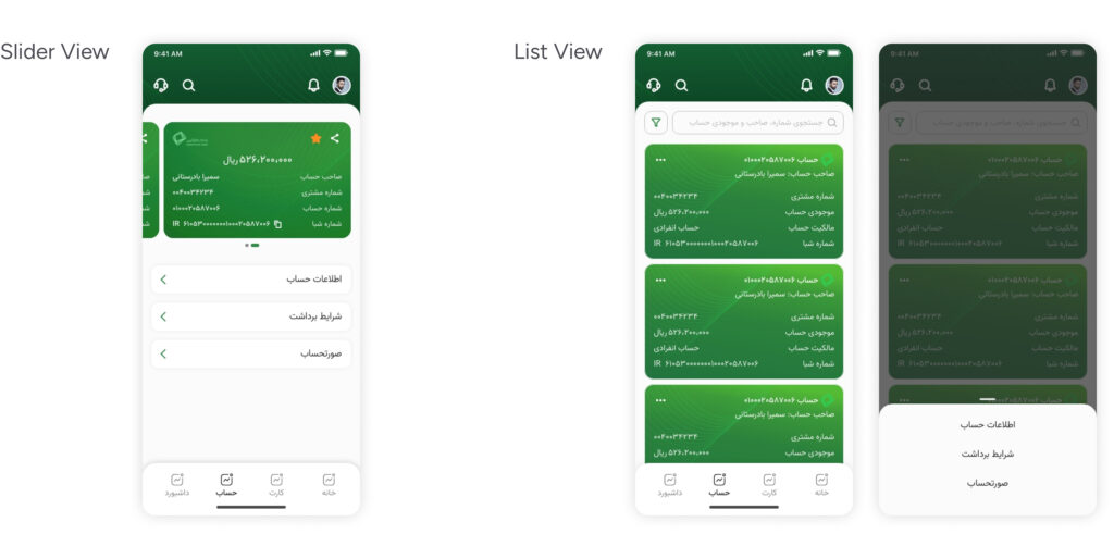
- Designing for Varied Account Needs
Based on the account data of individuals in the bank, which has contributed to persona creation, there are two main categories of customers. One category consists of customers who have opened an account to apply for loans, typically having two or three accounts. The other category comprises individuals who are very wealthy or own large businesses, often having around 50 accounts. These two user groups have different needs when it comes to using their accounts. Therefore, the design should cater to the requirements of both groups.
- Adaptable Account Displays
Initially, I decided to present the accounts in a list format, where users would select an account to access its services. However, this approach would require an additional action for users with fewer than three accounts to reach their desired services. To address this, I chose to display the accounts as a slider and list the services at the bottom of the page. However, the slider option was not suitable for users with over 50 accounts. Consequently, I decided to provide two different display options for users. Additionally, during the registration process, users are asked to activate their desired accounts, allowing us to realized the number of active accounts for each user. If the count is low, the slider view is presented, whereas if it is high, the list view is shown. Furthermore, it was essential to provide search and filtering capabilities for users with a large number of accounts.
Challenges And Takeaways
I worked on this project for one year from sctrach. Working on this product presented numerous challenges for me. I will mention some of the most important ones here:
- Lack of a Product Owner or Product Manager
There was no product manager or product owner in the project, which created additional responsibilities and challenges for me.
- Maintaining Product Consistency Across Different Platforms
One of the challenges was ensuring the consistency of the product across various platforms, considering the limitations of programming languages specific to each platform, such as Java, Swift, React Native, and others.
- Interacting with Developers
Another challenge I faced was directly interacting with frontend and backend developers. Initially, it posed a significant challenge as I had limited knowledge of programming.
- Constraints
Another challenge was working within the constraints of internal banking systems, security limitations, and privacy requirements, which significantly impacted the project.
Overall, I have learned many valuable lessons throughout this experience. For instance, understanding the key differences in designing for different operating systems based on the programming language, maintaining system consistency, implementing version testing, designing for financial business with its high sensitivity, effective collaboration with individuals from different professional domains, time and task management, utilizing data in design, and more.
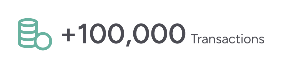
Performance Metrics 6 Months After Launch